No More Basic Plots Please
A Quick Guide to Upgrade Your Data Visualizations using Seaborn and Matplotlib
“If I see one more basic blue bar plot…”
After completing the first module in my studies at Flatiron School NYC, I started playing with plot customizations and design using Seaborn and Matplotlib. Much like doodling during class, I started coding other styled plots in our jupyter notebooks.
After reading this article, you’re expected to have at least one quick styled plot code in mind for every notebook.
No more default, store brand, basic plots, please!
If you can do nothing else, use Seaborn.
You have five seconds to make a decent looking plot or the world will implode; use Seaborn!
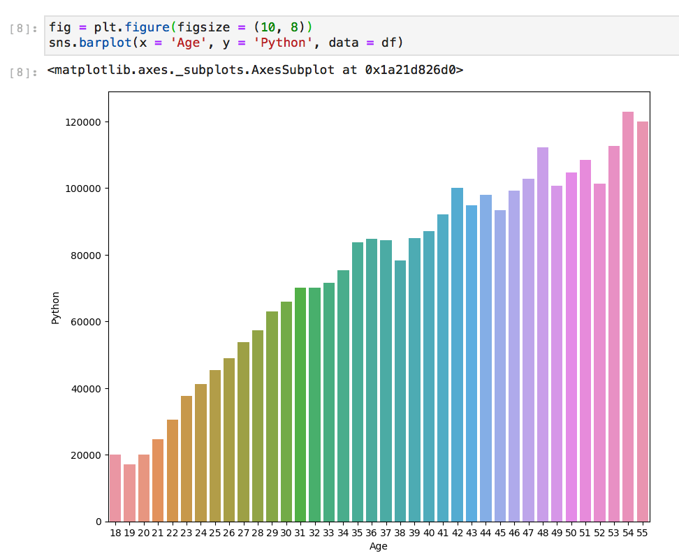
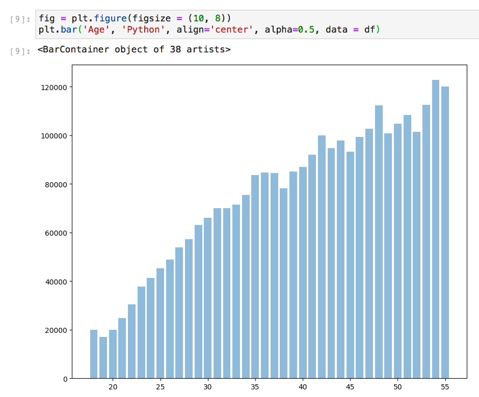
Seaborn, which is build using Matplotlib can be an instant design upgrade. It automatically assigns the labels from your x and y values and a default color scheme that’s less… basic. ( — IMO: it rewards good, clear, well formatted column labeling and through data cleaning) Matplotlib does not do this automatically, but also does not ask for x and y to be defined at all times depending on what you are looking to plot.
Here are the same plots, one using Seaborn and one Matplotlib with no customizations.
Style it from the top
Depending on the data you are visualizing, changing the style and backgrounds may increase interpretability and readability. You can carry this style throughout by implementing a style at the top of your code.
There is a whole documentation page on styline via Matplotlib.
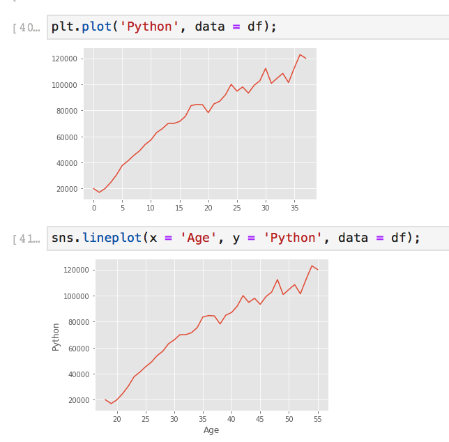
Styling can be as simple as setting the style with a simple line of code after your imported libraries. GGPlot changed the background to grey, and has a specific font. There are many more styles you can tryout.
XKCD; a cheeky little extra
Fun. Not professional. But so fun.
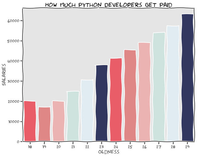
Be aware that if you use this XKCD style it will continue until you reset the defaults by running plt.rcdefaults()…
PRETTY COLORS OMG!
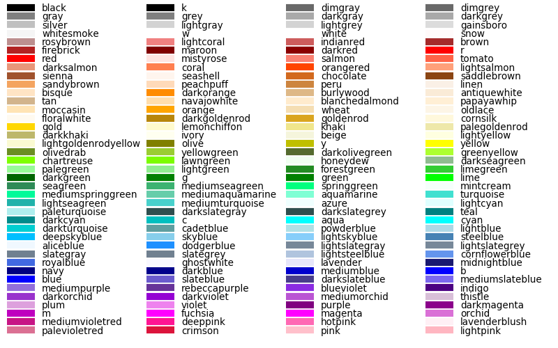
Make your plots engaging. Color theory comes into play here. Seaborn has a mix of palettes which can also be used in Matplot lib, plus you can also make your own.
Single Colors: One and Done
- Above is a list of single color names you can call to change lines, scatter plots, and more.
Lazy? Seaborn’s Default Themes
- has six variations of default
deep,muted,pastel,bright,dark, andcolorblind- use color as an argument after passing in x, y, and data
- color = ‘colorblind’
Work Smarter Not Harder: Pre-Fab Palettes
color_palette() accepts any seaborn palette or matplotlib colormap
- Personal favorites are ‘magma’ and ‘viridis’
Control Freak? Custom Palettes / Using Hex Codes
- pretty_colors = [“#FF4653”, “#EE7879”,“#DDEDF4”, “#2A3166”]
- pass in hex codes which can be found online
- create a kind and add in specifics, play around with the parameters for more customized palettes
Everything Should Have a Label
Here we are using Matplotlib, but we have added a single color for each line, a title, x and y labels, and a legend for clear concise interpretation.
Every variable has a home, and it sparks joy now, right? — Think how would Marie Kondo code.
Simple, but clear.
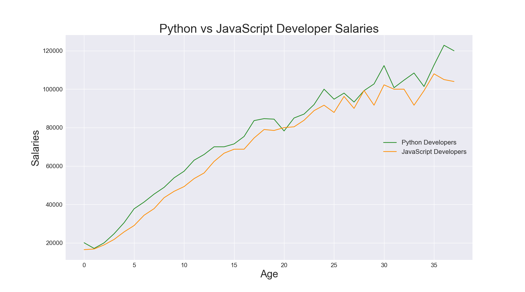
Overall, pretty simple right? Well, now you have no excuses for those ugly basic plots. I hope you found this helpful and mayb a little bit fun. There’s so much more on color and design in the documentation, so once you’ve mastered these quick tips, dive in on the documentation below!
Enjoy? Let’s be friends. Follow me on GitHub, Instagram, and Medium
Today’s Data by Corey Schaffer: Developer Salaries Data
Documentation:
Other Resources:
'Data Analytics(en)' 카테고리의 다른 글
| Scikit-Learn (Python): 6 Useful Tricks for Data Scientists (0) | 2020.10.06 |
|---|---|
| New Features in Python 3.9 (0) | 2020.10.05 |
| The Definitive Data Scientist Environment Setup (0) | 2020.10.03 |
| Extracting Data from PDF File Using Python and R (0) | 2020.10.02 |
| Advanced Python: Itertools Library — The Gem Of Python Language (0) | 2020.10.01 |