Data Science, Data Visualization
Data Visualisation using Pandas and Plotly

Let us imagine you are trying to convince a client to invest in your company. You exhibit all the employee’s records and their achievements in the form of an excel sheet rather than a bar chart or a pie chart. Imagine yourself in the client’s place. How would you react then? (Wouldn’t too much data be so overwhelming?). This is where data visualization comes into the picture.
Data visualization is the practice of translating raw data into visual plots and graphs to make it easier for the human brain to interpret. The primary objective is to make the research and data analysis quicker and also to communicate the trends, patterns effectively.
The human brain is programmed to understand visually appealing data better than lengthy plain texts.
In this article, Let us take a dataset, clean the data as per requirement, and try visualizing the data. The dataset is taken from Kaggle. You can find it here.
Firstly, to load the data from external sources and clean it, we will be using the Pandas library. You can study more about Pandas in my previous article here.
We need to import the Pandas library in-order to use it. We can import it by using it.
import pandas as pdLet us load the CSV file taken from Kaggle and try to know more about it.
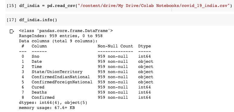
We can understand that the dataset has 9 columns in total. The Date and Time column indicate the last updated date and time. We are not going to use the ConfirmedIndianNational and ConfirmedForeignNational columns. Hence let us drop these 2 columns. The Time column is also immaterial. Let us drop it too. Since the Data Frame already has an index, the Serial No(Sno) column is also not required.

Right away, we can see that the data frame has only 5 columns. It is a good practice to drop redundant data because retaining it will take up unneeded space and potentially bog down runtime.
Here the Kaggle dataset is updated daily. New data is appended instead of overwriting the existing data. For instance, on April 13th dataset has 925 rows with each row representing the cumulative data of one particular state. But on April 14th, the dataset had 958 rows, which means 34 new rows(Since there are a total of 34 different states in the dataset) were appended on April 14th.
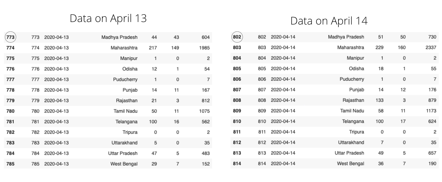
In the above picture, you can notice the same State names, but try to observe the changes in other columns. Data about new cases are appended to the dataset every day. This form of data can be useful to know the spread trends. Like-
- The increment in the number of cases across time.
- Performing time series analysis
But we are interested in analyzing only the latest data leaving aside the previous data. Hence let us drop those rows which are not required.
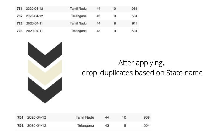
Firstly, let us sort the data by date in descending order. And get rid of the duplicate values by grouping data using state name.

You can see that the df_states data frame has only 30 rows, which means there is a unique row showing the latest stats for each state. When we sort the data frame using the date column, we will have data frame sorted according to dates in descending order(observe that ascending=False in code) and remove_duplicates stores the first occurrence of value and removes all its duplicate occurrences.
Let us now talk about data visualization. We will use Plotly to visualize the above data frame.
Histograms, Barplots, Scatter plots explain patterns and trends efficiently, but since we are dealing with geographical data, I prefer choropleth maps.
What are Choropleth maps?
According to Plotly, Choropleth maps depict divided geographical regions that are colored or shaded with respect to a data variable. These maps offer a quick and easy way to show value over a geographical area, unveiling trends and patterns too.
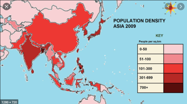
In the above image, areas are colored based on their population density. Darker the color implies higher the population in that particular area. Now with respect to our dataset, we are also going to create a choropleth map based on Confirmed cases. More the number of confirmed cases, darker the color of that particular region.
To render an Indian map, we need a shapefile with the state coordinates. We can download the shapefile for India here.
According to Wikipedia, The shapefile format is a geospatial vector data format for geographic information system (GIS).
Before working with shapefiles, we need to install GeoPandas, which is a python package that makes work with geospatial data easy.
pip install geopandas
import geopandas as gpd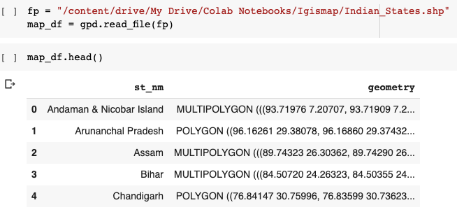
You can see that the data frame has a State name and its coordinates in vector form. Now we will convert this shapefile into the required JSON format.
import json#Read data to json.merged_json = json.loads(map_df.to_json())
Next, we are going to create Choropleth Maps using Plotly Express.’ px.choropleth function. Making choropleth maps requires geometric information.
- This can either be a supplied in the GeoJSON format(which we created above) where each feature has a unique identifying value (like st_nm in our case)
2. Existing geometries within Plotly that include the US states and world countries
The GeoJSON data, i.e. (the merged_json we create above) is passed to the geojson argument and the metric of measurement is passed into the color argument of px.choropleth.
Every choropleth map has a locations argument that takes the State/Country as a parameter. Since we are creating a choropleth map for different states in India, we pass the State column to the argument.
fig = px.choropleth(df_states,
                    geojson=merged_json,
                    color="Confirmed",
                    locations="State/UnionTerritory",
                    featureidkey="properties.st_nm",
                    color_continuous_scale  = ["#ffffb2","#fecc5c","#fd8d3c","#f03b20","#bd0026"],
                    projection="mercator"
)fig.update_geos(fitbounds="locations", visible=False)fig.update_layout(margin={"r":0,"t":0,"l":0,"b":0})fig.show()
The first parameter is the data frame itself, and the color is going to vary based on the Confirmed value. We set the visible argument in fig.updtae_geos() to False to hide the base map and frame. We also set fitbounds = "locations" to automatically zoom the world map to show our areas of interest.
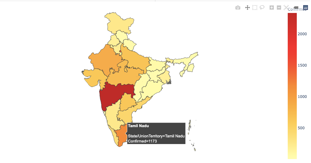
You can view the full code on Github here.
Data Visualization is an art that is highly underestimated. Hopefully, you have taken some concepts that will help when visualizing data in real-time. Do feel free to share your feedback and responses. Raise your hands if you’ve learned something new today.
'Data Analytics(en)' 카테고리의 다른 글
| Extracting Data from PDF File Using Python and R (0) | 2020.10.02 |
|---|---|
| Advanced Python: Itertools Library — The Gem Of Python Language (0) | 2020.10.01 |
| Bye-bye Python. Hello Julia! (0) | 2020.09.29 |
| Python Lambda Expressions in Data Science (0) | 2020.09.29 |
| Launch of the New Jupyter Book (0) | 2020.09.28 |